Case Study: Krisen App.
UX Design for Disaster Preparedness
UX Design for Disaster Preparedness
Final project for "UX and Digital Product Design" Course
Berghs School of Communication, 2020
Berghs School of Communication, 2020
Description
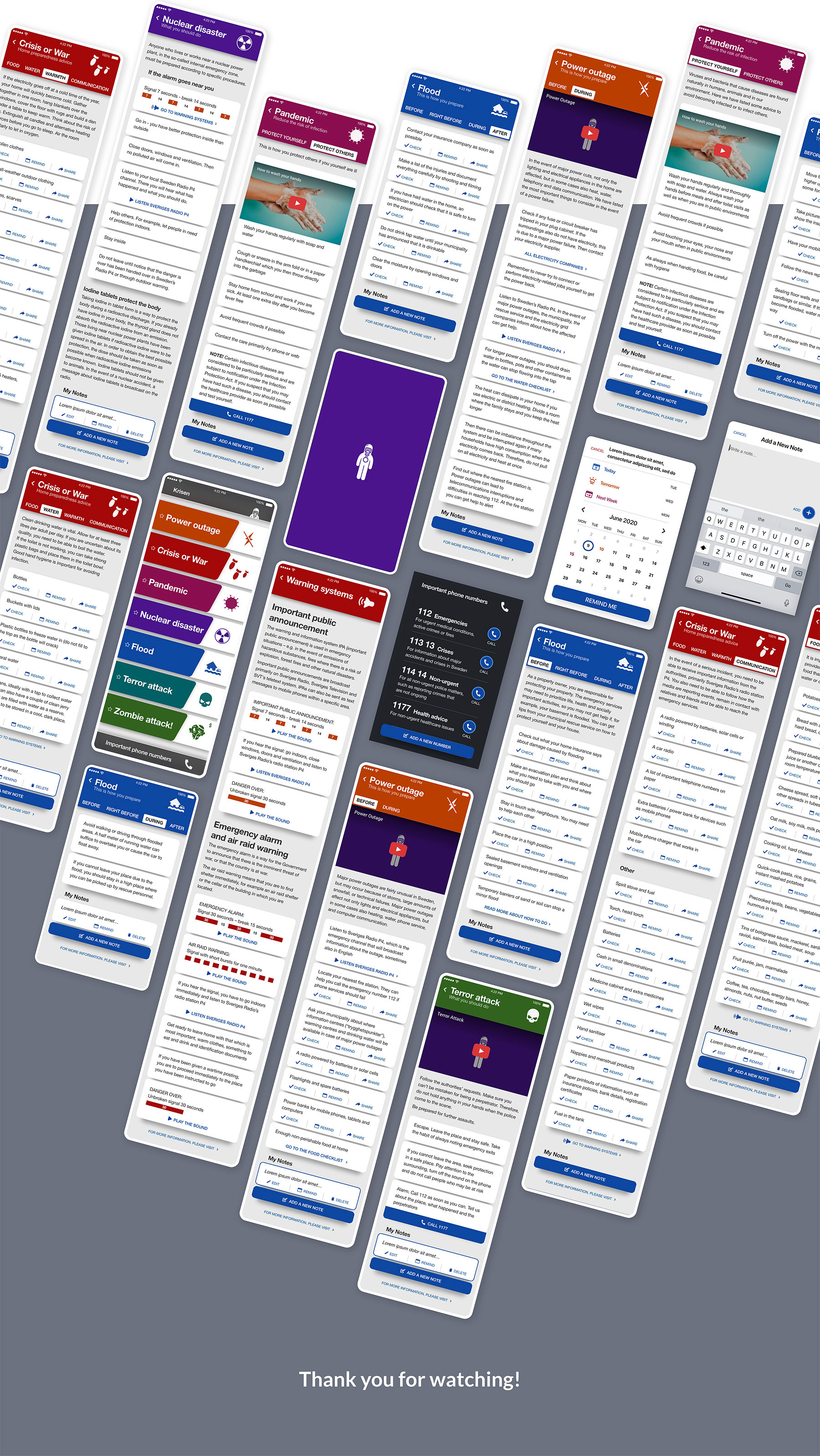
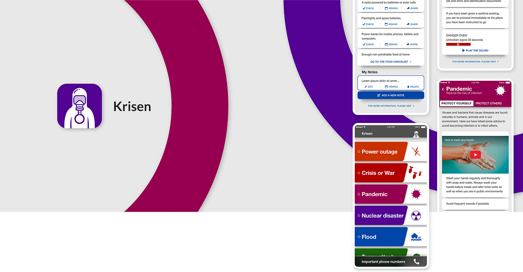
“Krisen” (The Crisis) is a mobile app that helps people in Sweden being prepared for disasters that can occur in life, such as flood, long term power outage, warlike situations or a brand new type of a Corona virus pandemic!
This is my final project for UX and Product Design Course in Berghs. All the process and the final product is in English following the official course language.
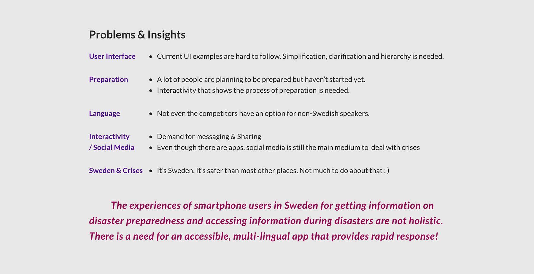
The Problem
There already are apps mostly created by government agencies in Sweden that provide service for disaster preparedness in the market, however every one of them has problems either on visual or on structural side.
The Challenge
To create a mobile app as simple, as useful, as interactive as possible without sacrificing from visual quality and accessibility requirements was a challenge. This is how I did it:
_______
Research
My goal for my research was to find out the fundamental needs and common pain points of users in existing mobile apps and printed materials when it comes to disaster preparedness.
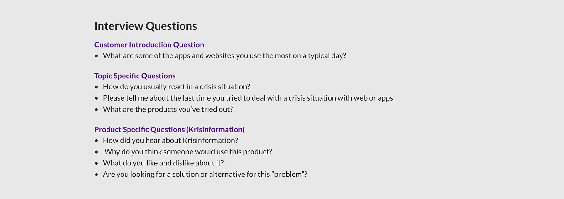
Interviews
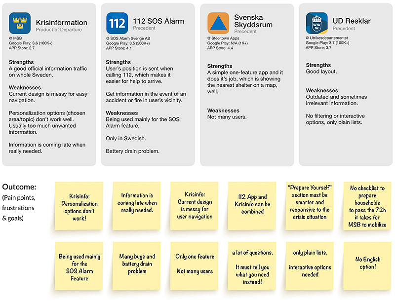
I managed to conduct face-to-face interviews with three potential users who are living in Sweden. I asked open questions and gave the interviewees the chance to talk more about their past experiences and future expectations regarding the topic and the product. Krisinformation was the most comprehensive product on disasters in the market, so I placed it as the point of departure to map the issues and composed interview questions around it.
_____
Precedent Analysis
1. Mobile Apps
1. Mobile Apps
Here are 4 mobile apps and 1 brochure for disaster preparedness/crisis management in Sweden. I conducted an online research to understand strengths and weaknesses of the apps from users’ perspective.
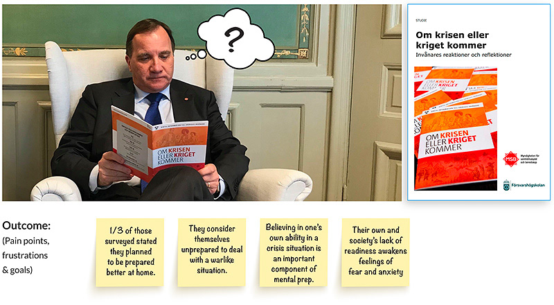
2. Brochure "Om Krisen eller Kriget Kommer"
“Om Krisen eller Kriget Kommer” (If Crisis or War Comes) is a brochure which was sent to all 4,9 million households in Sweden at the behest of Swedish Government in 2018. The aim was to communicate how people can prepare for a crisis or a war. The same authorities also conducted an extensive survey on citizens’ reactions and reflections to this brochure in 2019. I used this survey as a crucial data source for my research.
_____
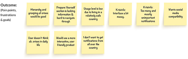
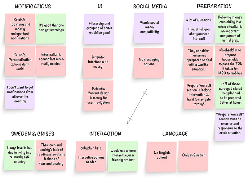
Affinity Map
Based on the outcomes of the interviews, survey and precedent analysis, I developed an affinity map to organize the information and to see the common patterns. (the simplified version of it can be seen below)
🟥 Negative (Pain Points)
🟩 Positive
🟪 Possibility
🟥 Negative (Pain Points)
🟩 Positive
🟪 Possibility
_____
Define
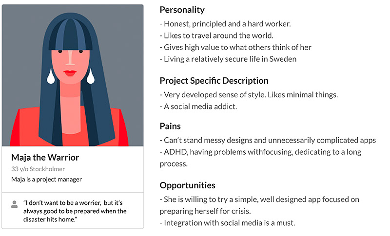
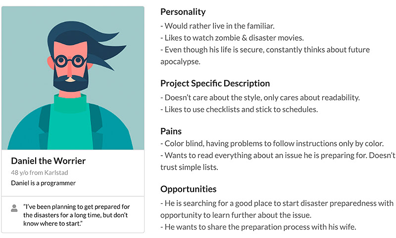
User Personas
Following the above research, I collated all that I had learnt to formulate 2 personas which represents 2 most likely user stereotypes (1.Maja the Warrior was based on interview outcome, 2.Daniel the Worrier was based on the desk research outcome). I also added visual and cognitive impairments to the personas in order to test accessibility of the product.
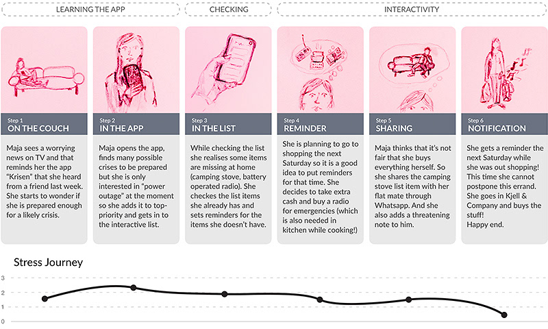
User's Journey Map
This is one of the likely scenarios where Maja the Warrior (persona 1) uses the app for the first time.
_______
Ideation
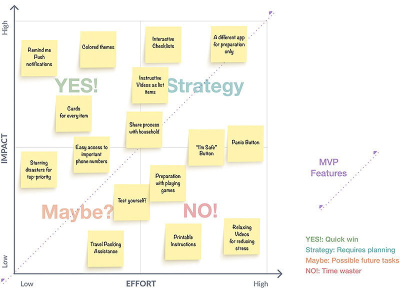
Idea-Matrix
In order to create an extensive list of functions to evaluate, I’ve gone through ideation processes such as brainwriting and 10+10. Here you can see the very final step of brainstorming which is an Idea-Matrix towards the MVP (Minimum Viable Product).
_____
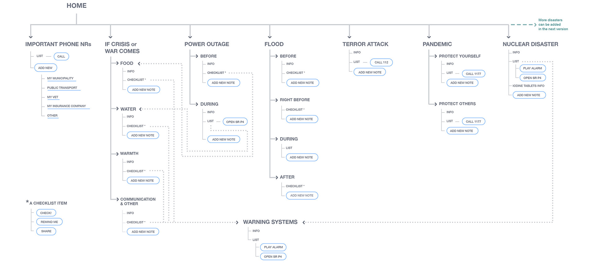
Information Architecture
Here is the information architecture of the product which combines lists with actions.
For the interactive lists, I took the data from 3 sources by authorities (krisinformation.se, dinsäkerhet.se and Om Krisen eller Kriget kommer Brochure). I didn't alter the content except merging overlapping parts, linking items to related external sources/actions (such as calling the police, opening the radio app etc.) or embedding videos&sounds.
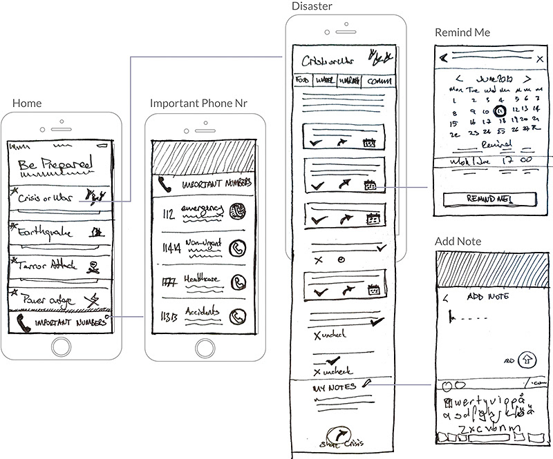
Wireframes
Based on the flowchart, I prepared Lo-Fi paper wireframes, which is a great way to do quick user testing at this point of the process. After testing and getting feedback from one of the original interviewees, I proceed to Interface design.
_____
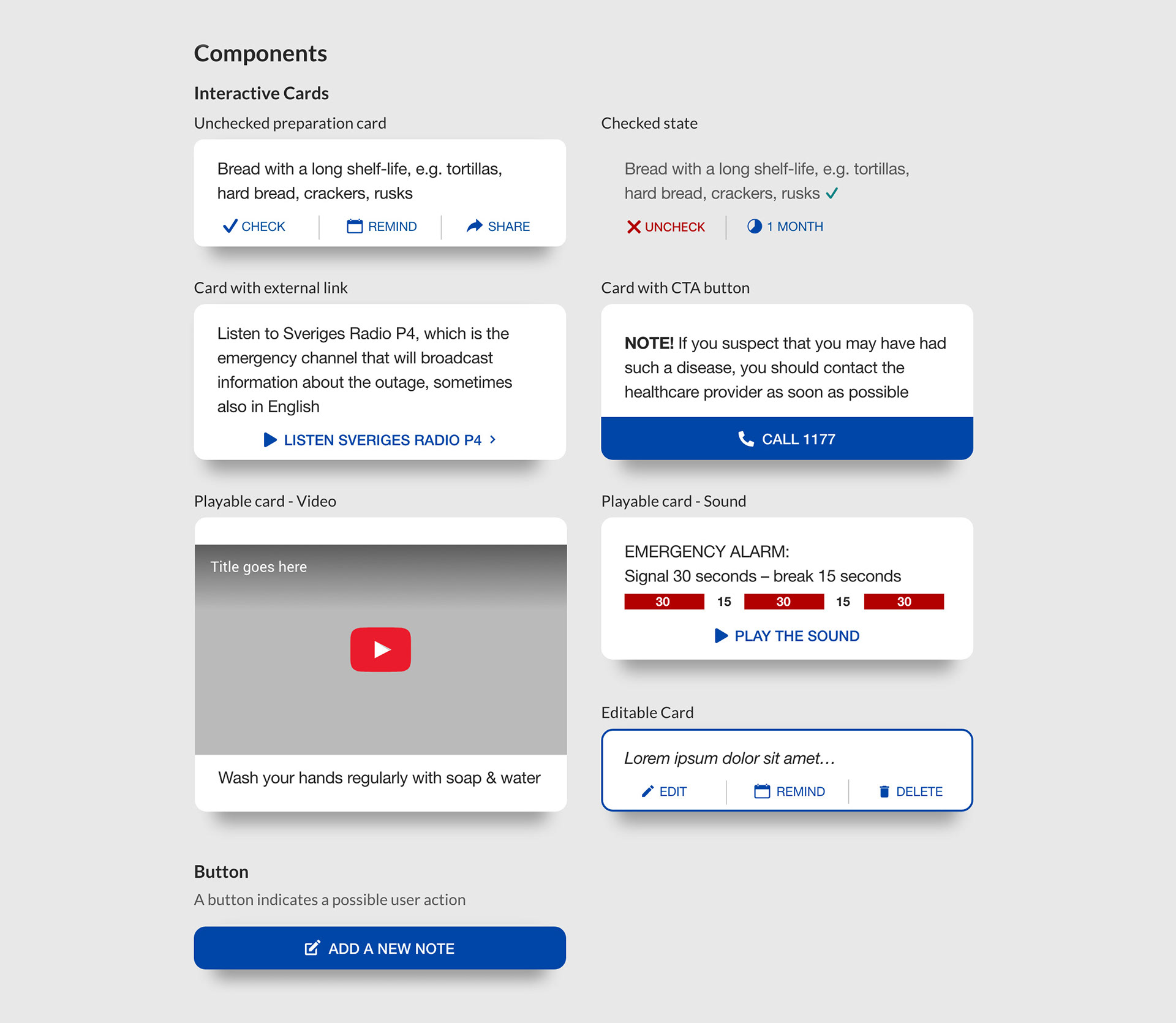
Design System
Based on the paper wireframes established after the user testing session, I started to build a dedicated design system. I wanted to create the style minimalistic, bright and contrasting with maximum accessibility. Everything in this application should look easy to understand/follow even for people with visual or cognitive impairment (see the personas).
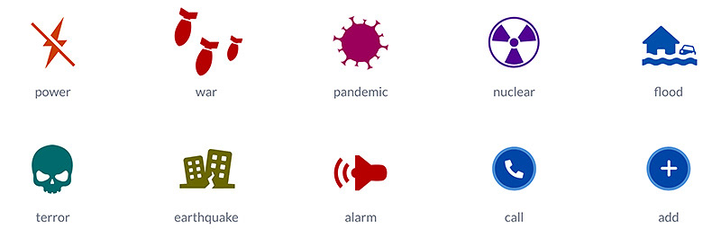
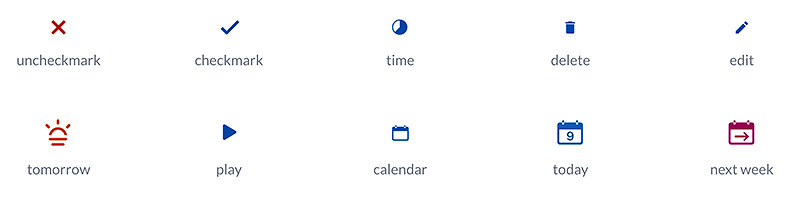
Icons
Large icons represent disasters and actions in menus and home screen.
Small icons represent actions in interactive cards.
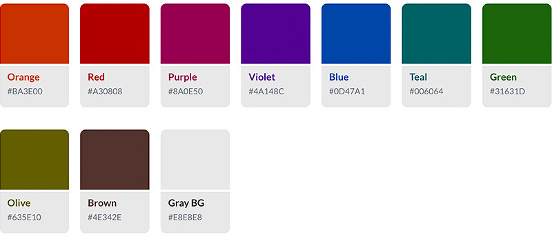
Colors
These are the default color variables in Krisen.
Color contrasts comply with WCAG 2.1 AA level requirements (4.5:1)
Color contrasts comply with WCAG 2.1 AA level requirements (4.5:1)
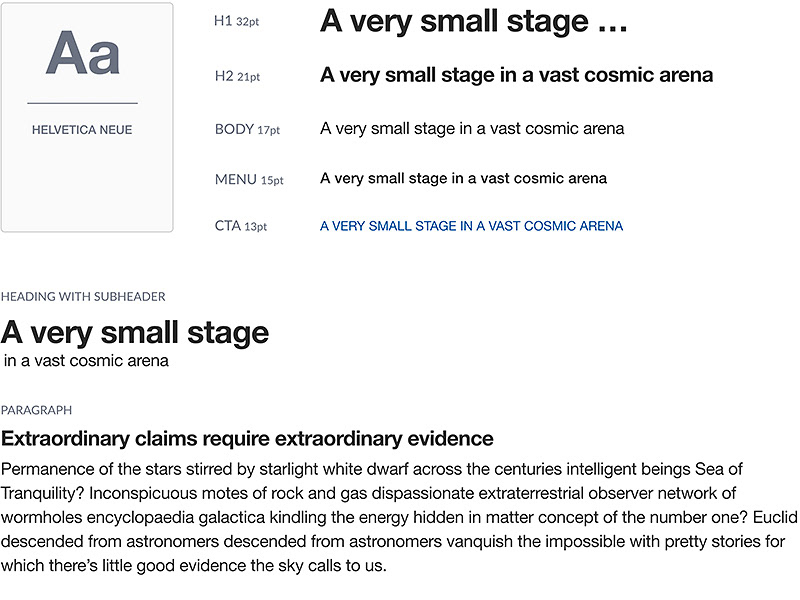
Typography
The default font in Krisen called Helvetica Neue.
Color contrasts, and font sizes comply with WCAG 2.1 AA level requirements
Color contrasts, and font sizes comply with WCAG 2.1 AA level requirements
Prototype
Please click on the screen below to start the prototype and surf through the interactive lists.
_____
All Screens